MediConnect
Creating an all in one solution for personal healthcare management.
May 2025
Timeline: 8 weeks
Role: Designer
Tools: Figma, JourneyTrack
Project Summary
MediConnect is an all-in-one online medical platform designed to accommodate patients' every need. From chatting with doctors, scheduling appointments, reviewing logs, or refilling prescriptions, MediConnect provides a smooth and effortless experience to users. Tried and tested UX and UI methodologies and principles were applied to MediConnect in order to meet the project's true goal: Create an online platform that empowers patients, providing them with worth, agency, and ownership over their healthcare needs through the medium of a frictionless user experience. This is a complete case study for the design of the MediConnect app. If you would like to view the prototype, feel free to skip ahead.
Research & User Interviews
Interviews were conducted in order to learn more about potential users' experiences with existing health management portals. Candidates were asked which platforms they had used, and were presented with a series of questions from a single consistent script. The main goals of the user interviews were to understand context, uncover pain points in existing platforms, explore thought processes and decision making, and gather language and terminology. Gathering language and terminology is something that I believe often goes overlooked, but is extremely important to me as a UX designer. Understanding the names that users assign to various parts of applications and processes in their own words helps to shape the way I include nomenclature in my own work. This is to ensure that what I create uses the same naming and terminology that a user is familiar with, and that feels most natural to them.
Top Interview Takeaways:
Interviewees expressed a desire for the following traits and features:
-
A central dashboard that allows them to see all the functionalities that the platform has to offer.
-
A way to send messages directly to their healthcare providers.
-
A way to view their test results in a clear and easily interpretable manner.
-
The ability to schedule new appointments and manage upcoming ones.
These takeaways provide key insights into what users are looking for, and which features to prioritize during the design process. This research ensures that feature implementation is based on what users want and need, in order to maximize the value that the platform brings to its end users. Of all requested features, the ability to manage and schedule appointments was the most important. Because of this, I made this feature the subject of the journey maps which I created in JourneyTrack.
Personas
Personas were created based on the types of users that were interviewed. These personas were based on either a specific potential user that was interviewed or a culmination of multiple interviewees.
New User

Returning User

Expert User

Journey Maps
A journey map was created for each persona based on the process of scheduling a new appointment. This helped to give me a better idea of what each persona would be thinking and feeling at each step of the user journey. This process is very helpful for clearly presenting seemingly obvious trouble areas that otherwise may be buried in the user journey. The types of issues that journey maps bring to light are ones that are clear in hindsight, but oftentimes difficult to initially recognize. In order to prevent these issues in the first place, the journey maps are created and analyzed. Journey maps are organized in a progressive order, starting with users possessing a low level of technological proficiency, and scaling upwards towards users of higher proficiency. This allows me to find the most glaring issues first, and then work my way up to issues which even the most technically proficient users may find themselves facing.
Journey Map: Beginner Level Proficiency

Journey Map: Intermediate Level Proficiency

Journey Map: High Level Proficiency

The goal of the ideation phase was to ensure that the maximum amount of user demands and features were implemented in the initial design phase. Additionally, the goal was to reference research and leverage the insights generated via persona journey mapping to create a list of features and characteristics to be implemented into the initial wireframe design.
Ideation Phase
The following is the result of the initial ideation phase of the design process done in Miro:

Mobile Sketches
The next step of the ideation phase was to generate some preliminary sketches, and begin thinking about some design patterns that would contribute to the final prototype. The initial sketches were completed in a timed environment in order to minimize over-analysis of features and implementation, to instead allow ideas to flow uninhibitedly.
Sketches were first created for mobile, adhering to a mobile-first ideology:
Dashboard


Appointments


Messages
Visit Notes


Test Results
Medications


Billing & Payments


Profile


Desktop Sketches
After the mobile sketches were completed, desktop sketches were derived from the mobile views:
Dashboard

Appointments


Visit Notes


Test Results

Medications

Billing & Payments


Profile


Mobile Prototype
The prototype for the MediConnect platform was created in Figma. The prototype consists of high fidelity designs for both desktop and mobile:
Dashboard


Appointments


Messages


Visit Notes


Test Results


Medications


Billing & Payments


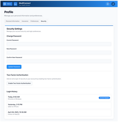
Profile


Desktop Prototype
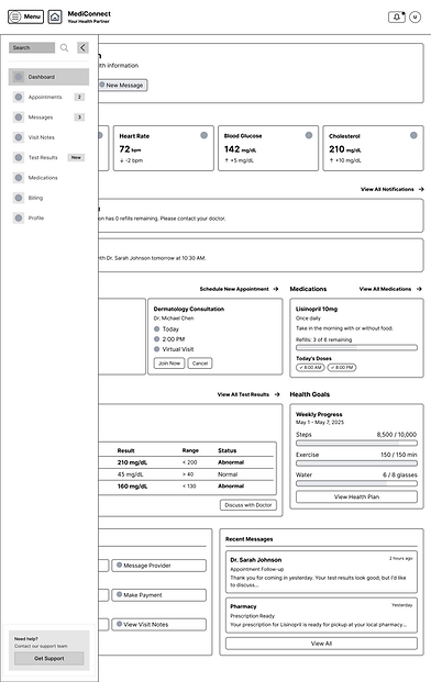
Dashboard


Appointments


Messages


Visit Notes


Test Results


Medications


Billing & Payments


Profile Page